Studio Tokyo / Discover. Collect. Create.
Burger King
Heritage that still feels appetizing.
- Edition
- 2021 / Food first
- Design credit
- Jones Knowles Ritchie · Burger King
- Sector
- Food & drink
- Form
- Typographic emblem
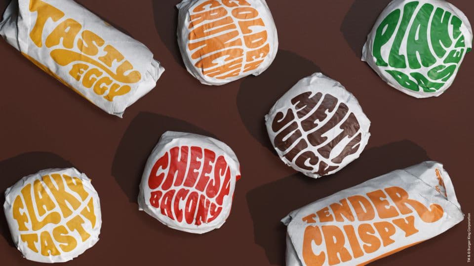
The identity system
Rounded lettering and oversized packaging type make the food story tangible. The logo’s bun-like enclosure and the broader typography share a soft, substantial character.
Editorial study of the published system
Documented process
JKR rebuilt the identity around real food and flame-grilling. The program combines a 1969-inspired logo, the custom Flame typeface, a warmer palette and food photography, extending through packaging, uniforms and signage.
Read the sourceSources & credits
Curated September 2026. Design and source imagery belong to their credited owners. This is an independent educational study, not an asset license or an affiliation.